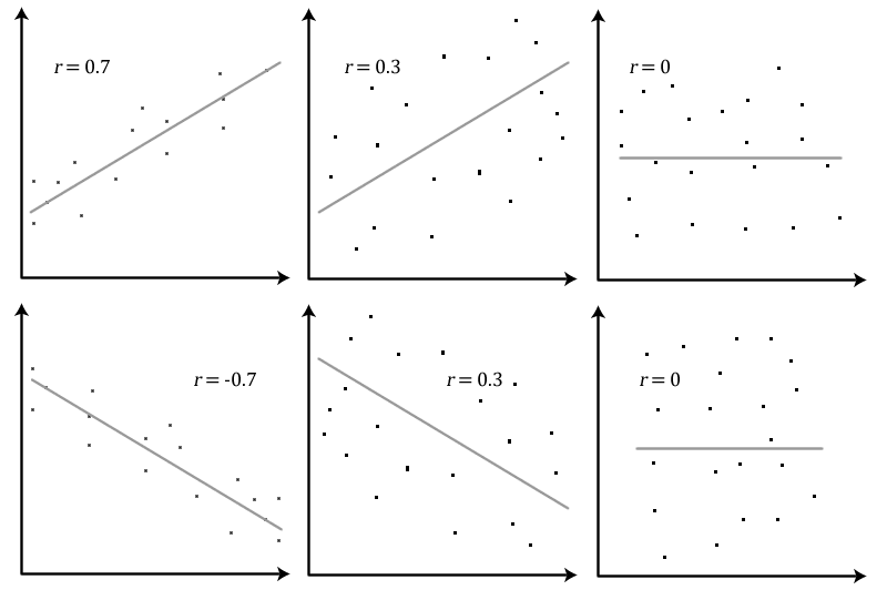
[Edit. A brief statistics lesson: A correlation is a measure of the linear relationship between two variables, ranging from r = -1 to +1; an r=1.00 is a relationship means that as one variable increases, there is a proportionate increase in the second variable. r=0 means no linear relationship. r=-1.00 means that as one variable decreases, the second variable decreases proportionally, as shown here. When a finding is referred to as 'significant', that means the probability of getting a result of that size if there were no true relationship is less than 5%. The "p" you'll see is referring to this probability. For example, p = 0.001 means the probability of this finding of this size, assuming no relationship, is 0.1%
If the dry statistics aren't your thing, you can scroll right to the bottom to see the relationships depicted more clearly with some barcharts.]
A while back, I wrote a blog post about my shenanigans with publicly available datasets about health, poverty and the outcome of Work Capability Assessments for people being migrated from Incapacity Benefit to Employment & Support Allowance.
I contacted the Government to give them an opportunity to respond; to point out any egregious errors I’d made that rendered my analysis and conclusions invalid, or to just acknowledge my findings and make appropriate use of them. Obviously, this did not happen and the response I received was somewhat laughable, rapidly boiling down to the standard Conservative tropes of “LABOUR’S FAULT! TAXPAYERS! FAIRNESS!”.
Raquel Rolnik, Special Rapporteur on Housing for the United Nations currently on a fact-finding mission to the UK looking at the impact of the ‘Bedroom Tax’, has apparently been asking for evidence related to wider welfare reforms, including the functioning of the Work Capability Assessment and Employment & Support Allowance.
With this in mind, and the Government’s cursory dismissal of my findings still ringing in my ears, I decided that Rolnik may be an appreciative recipient of this data. The ESA dataset I used is updated regularly, with the latest set including reassessments conducted up to July 2013. I therefore decided to perform a similar analysis as before with the new data to ensure the most up-to-date information was sent to Rolnik.
This data covers 325 of the 326 administrative districts of England and 725,180 individual Work Capability Assessments. The various WCA outcomes are shown below in Table 1.
Outcome
|
Mininum %
|
Maximum %
|
Average %
|
Standard Deviation
| |
Work Related Activity Group
|
27.08
|
52.48
|
38.83
|
4.28
| |
Support Group
|
20.50
|
42.86
|
30.66
|
4.48
| |
Fit for Work
|
14.84
|
40.90
|
24.92
|
4.38
| |
Claim closed
|
1.56
|
7.58
|
3.75
|
0.93
| |
Awaiting WCA
|
0.00
|
7.23
|
2.67
|
1.66
|
The health measures I used were average life expectancy at birth, rates of early death due to cardiovascular disease and stroke and rates of early death due to cancer.
The socioeconomic data I used was the proportion of a district’s population living in one of England’s 20% most deprived LSOAs, the population living in one of the 20% least deprived LSOAs and the Indices of Deprivation “Local Concentration” score standardised; a population-weighted average of the deprivation scores of that district’s most deprived LSOAs that contain 10% of the district’s population, standardised to a mean of 0. Higher scores on this variable are indicative of higher levels of deprivation.
Variable
|
Minimum
|
Maximum
|
Average
|
Standard Deviation
| |
Life Expectancy (yrs)
|
76.5
|
87.45
|
80.86
|
1.52
| |
Early Death Rate (cancer)
|
35.50
|
123.20
|
64.90
|
15.90
| |
Early Death Rate (CVD)
|
77.90
|
159.10
|
108.50
|
14.90
| |
Most Deprived 20% Area Population (%)
|
0
|
82.99
|
14.80
|
16.96
| |
Least Deprived 20% Area Population (%)
|
0
|
87.55
|
23.44
|
20.00
| |
Local Concentration
|
-3.30
|
1.26
|
0.00
|
1.00
|
As you can see, there is a lot of variation in the rate of the various Work Capability Assessment outcomes and, for a supposedly objective test, this is worthy of further investigation.
First, I correlated the health variables with the various WCA outcomes, similar to my last analysis. The results of these correlations are below.
Life Expectancy
|
Early Death Rate (CVD)
|
Early Death Rate (Cancer)
| |
% WRAG
|
ns
|
ns
|
Ns
|
% Support
|
.363**
|
-.244**
|
-.325**
|
% Fit
|
-.474**
|
.421**
|
.447**
|
% Closed
|
.241**
|
-.259**
|
-.198**
|
% Waiting
|
.323**
|
-.175**
|
-.249**
|
Notes: ns = non-significant,. ** = p< .001
There was no significant relationship between local health and the proportion of people going into the Work-related Activity Group.
However, there was a significant relationship between health and the other WCA outcomes:
- The proportion of Support Group judgements paradoxically increased as the health of the district increased.
- The proportion of fit for work judgements, again paradoxically, increased as the local health of an area decreased.
- The proportion of claims being closed increased as the local health increased
- The proportion of claims awaiting assessment increased as the health of the district increased.
The relationship between the percentage of fit for work judgements and health is the strongest of the other outcomes and this is illustrated in the graph below. This is alarming, as it suggests that people in the unhealthiest areas are being found fit for work more often than their healthy-area counterparts.
However, Support Group judgements also increase with the health of an area. From the claimant’s perspective, this is often an ideal outcome. It comes with slightly more valuable benefit payments and less conditionality. As a benefit category intended for ‘the most sick and disabled’, it is perplexing that the proportion of Support Group judgements is higher in healthier areas.
Secondly, I correlated local socioeconomic deprivation with WCA outcomes, and the results are presented in the table below.
Local Concentration
|
% in 20% most deprived LSOA
|
% in 20% least deprived LSOA
| |
% WRAG
|
ns
|
-.139*
|
ns
|
% Support
|
-.373**
|
-.198**
|
.294**
|
% Fit
|
.453**
|
.411**
|
-.304**
|
% Closed
|
-.271**
|
-.260**
|
.322**
|
% Waiting
|
-.137*
|
-.120*
|
ns
|
Notes: ns = non-significant,.* p< .05 ** = p< .001
The relationship between deprivation and WCA outcome is also statistically significant.
- As the proportion of a district’s population in one of the 20% poorest LSOA’s of England increases, work-related activity group judgements decrease.
- As the deprivation of a district increases, a lower proportion of claimants are placed into the Support Group.
- As the deprivation of a district increases, a higher proportion of people are found fit for work.
- As the deprivation in an area increases, the proportion of claims being closed before assessment increases.
- As the deprivation in a local area increases, the proportion of people awaiting assessment decreases.
Therefore, the WCA outcomes also show a significant relationship with levels of socioeconomic deprivation in a district as well as with that district’s health. Particularly worrying are the proportions of Fit for Work and Support Group judgements; suggesting that people in poorer areas are more likely to be found fit for work and that people in richer areas are more likely to be placed in the Support Group.
It is also worth noting that, contrary to the ‘workshy scrounger’ rhetoric, the proportion of claims being closed is higher in richer areas. It is also interesting that a higher proportion of claims are awaiting assessment in poorer areas.
There is a significant causal relationship between poverty and health, well established in the scientific literature. In the current dataset, for example, life expectancy and Local Concentration correlate significantly (r = -.749). It is possible that the observed effects of deprivation above occur because higher deprivation lowers health. Therefore, the next analysis will address this.
Partial correlations, controlling for all the health variables, were conducted between each of the WCA outcomes and each of the deprivation variables. The results are shown below
Local Concentration
|
Most Deprived %20 LSOA Population
|
Least Deprived %20 LSAO Population
| |
% WRAG
|
ns
|
-.152*
|
Ns
|
% Support
|
-.238**
|
ns
|
.180**
|
% Fit For Work
|
.164**
|
ns
|
ns
|
% Closed
|
-.123*
|
-.092*
|
.210**
|
% Waiting
|
ns
|
.097*
|
-.233**
|
Notes: ns = non-significant. *p ≤ .05, ** p ≤ .01
I also conducted a Sobel analysis of the effects of the proportion of the local concentration in the 20% most deprived LSOAs and Life Expectancy on % of Fit for Work judgements. This was highly significant (z = 4.11, p = <.001) and supports the hypothesis that deprivation exerts both a direct and indirect effect upon WCA outcome. The model indicates that as deprivation increases, so does the proportion of claimants found fit for work. However, deprivation also decreased life expectancy and decreased life expectancy lead to a higher proportion of fit for work judgements.

The next few graphs are simply for clarity; they illustrate the relationship between WCA outcome and health/deprivation more clearly, using the highest 10%, lowest 10% and median (45-55%) 10% to make groups of high, low and average on a particular variable. The first graph shows the proportion of WCA outcomes varying across high, low and average life expectancy groups.

This next graph illustrates the various WCA outcomes varying across disricts with high, low and average socioeconomic deprivation, with the proportion of Support Group judgements decreasing in poorer areas as the proportion of Fit for Work judgements increases.

This final graph illustrates the proportion of people living in England's 20% poorest LSOA (a geographic area of 1,000 to 3,000 people) across the areas that have the most, least and average amount of Fit for Work judgements, with a much higher proportion of people living in the poorest LSOAs in district's that declare a higher proportion of ESA claimants fit for work.

But what can we make of all this? It appears clear that there is a significant bias in WCA outcomes, with the poorest and unhealthiest areas at a significant disadvantage compared to richer, healthier areas. The effect shown in the last graph, for example, is a very strong effect (Cohen's d = .85).
I can think of a few potential causes for such an effect.
The first (and I think least likely) is a conscious bias in the design or implementation of the WCA.
A second potential cause is that the conditions which limit life expectancy that are more common in deprived areas (such as obesity) are being 'rooted out' of the Incapacity Benefit cohort. However, this seems unlikely considering the myriad other conditions which do affect both life expectancy and ability to work (e.g. depression) also being significantly associated with socioeconomic deprivation.
A third cause is an unintentional bias in the design or implementation of the WCA, and I feel this to be the most likely cause. This could manifest as, for example, people in poorer areas being less likely to be able to get sufficient information, such as from the Internet, to ensure an accurate WCA outcome.
I have no doubt that there are other potential causes I have yet to think of that could account for this relationship, but explaining this relationship is not my purpose here. My purpose, as it was when I contacted the Government directly, is to make people aware of this evidence of the WCA not functioning fairly.
It is worth remembering that I found this evidence hidden away in publicly available and free Government datasets. They're refusing to perform a similar analysis of their own as part of the demands of the WOW Petition, and they're refusing to acknowledge my findings now. Therefore, I've done the next best thing.
I've presented these findings to the Government. I've presented these findings to Rolnik as part of her request for information, and I've presented them to you. Make of them what you will.